Lab 5-3: Mixing length theory at Kettle Ponds#
Written by Eli Schwat - February 2024.
import xarray as xr
import numpy as np
import os
import urllib
import pandas as pd
import datetime as dt
import matplotlib.pyplot as plt
import altair as alt
SOS Data#
sos_file = "../data/sos_full_dataset_30min.nc"
sos_dataset = xr.open_dataset(sos_file)
Plotting velocity profiles during different stability conditions#
The dataset already has temperature gradients (that indicate stability) calculated.
sos_dataset['temp_gradient_3m_c'].loc['20221101'].plot()
[<matplotlib.lines.Line2D at 0x7f10dfbb8750>]
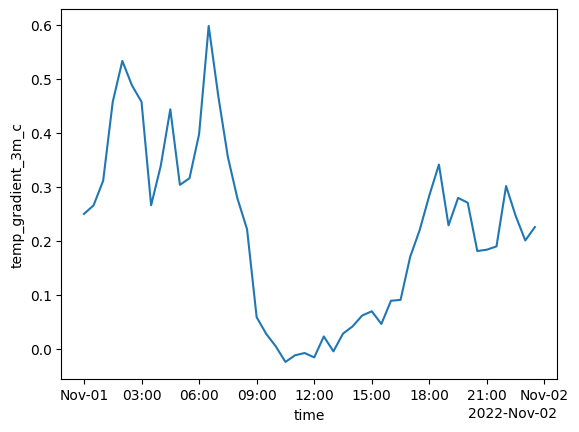
We can see that the atmosphere was stable except for the middle of the day
Let’s look at velocity profiles at different times of the day. What do we expect them to look like?
wind_df = sos_dataset[[
    'spd_1m_c',
    'spd_2m_c',
    'spd_3m_c',
    'spd_5m_c',
    'spd_10m_c',
    'spd_15m_c',
    'spd_20m_c',
]].to_dataframe().melt(ignore_index=False)
# Extract the number from the string in the 'column'
wind_df['height'] = wind_df['variable'].str.extract('(\d+)').astype('int')
wind_df
| variable | value | height | |
|---|---|---|---|
| time | |||
| 2022-11-01 00:00:00 | spd_1m_c | 0.847002 | 1 |
| 2022-11-01 00:30:00 | spd_1m_c | 1.782696 | 1 |
| 2022-11-01 01:00:00 | spd_1m_c | 1.118848 | 1 |
| 2022-11-01 01:30:00 | spd_1m_c | 1.762465 | 1 |
| 2022-11-01 02:00:00 | spd_1m_c | 1.999188 | 1 |
| ... | ... | ... | ... |
| 2023-06-19 15:30:00 | spd_20m_c | 3.620165 | 20 |
| 2023-06-19 16:00:00 | spd_20m_c | 5.240737 | 20 |
| 2023-06-19 16:30:00 | spd_20m_c | 4.676786 | 20 |
| 2023-06-19 17:00:00 | spd_20m_c | 4.952941 | 20 |
| 2023-06-19 17:30:00 | spd_20m_c | 3.563722 | 20 |
77518 rows × 3 columns
Let’s look at wind velocity profiles at 12pm (near neutral conditions)
Here, we plot both in linear space (left plot) and log space (right plot)
base = alt.Chart(
    wind_df.loc['20221101 1200']
).mark_circle(size=50).encode(
    alt.X('value:Q')
).properties(width=150, height = 150)

(
    base.encode(alt.Y('height:Q'))
    |
    base.encode(alt.Y('height:Q').scale(type='log'))
)
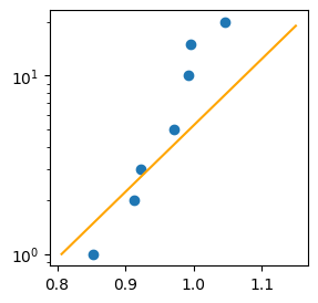
How about at 5pm during stable conditions?
base = alt.Chart(
    wind_df.loc['20221101 1700']
).mark_circle(size=50).encode(
    alt.X('value:Q')
).properties(width=150, height = 150)

(
    base.encode(alt.Y('height:Q'))
    |
    base.encode(alt.Y('height:Q').scale(type='log'))
)
We see that the wind profile is not quite logarithmic…it seems to depart from a logarithmic curve higher up.
Why would the velocity profile depart from the log curve like it does above, during stable conditions?
Fitting a log profile to the measured velocity profile#
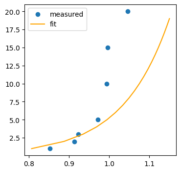
Let’s fit a wind profile to the 1200 data
For this exercise, we will assume a z0 value, but we could calculate it if we wanted to.
We will also extract a measured \(u^*\) value.
sos_dataset[[
    'u*_3m_c',
    'u*_5m_c',
    'u*_10m_c',
    'u*_15m_c',
]].to_dataframe().loc['20221101 1200']
u*_3m_c     0.046698
u*_5m_c     0.066276
u*_10m_c    0.101627
u*_15m_c    0.110692
Name: 2022-11-01 12:00:00, dtype: float64
ustar_df = sos_dataset[[
    'u*_3m_c',
]].to_dataframe().melt(ignore_index=False)
z0 = 0.001

ustar = ustar_df.loc['20221101 1200'].value
plt.figure(figsize=(3,3))
plt.scatter(
    wind_df.loc['20221101 1200']['value'],
    wind_df.loc['20221101 1200']['height'],
    label='measured'
)
plt.plot(
    (ustar / 0.4)*np.log(np.arange(1,20,1) / z0),
    np.arange(1,20,1),
    color='orange',
    label='fit'
)
plt.yscale('log')
plt.legend
<function matplotlib.pyplot.legend(*args, **kwargs) -> 'Legend'>
plt.figure(figsize=(4,4))
plt.scatter(
    wind_df.loc['20221101 1200']['value'],
    wind_df.loc['20221101 1200']['height'],
    label='measured'
)
plt.plot(
    (ustar / 0.4)*np.log(np.arange(1,20,1) / z0),
    np.arange(1,20,1),
    color='orange',
    label='fit'
)
plt.legend()
<matplotlib.legend.Legend at 0x7f10de945490>
How could we extract \(z_0\) and \(u^*\) from the data?